

Decred On-Chain: Macro + Micro Outlook
During bull markets the Realized Cap serves as support for the Decred Market Cap, and during bear markets it flips into resistance.

By Permabull Nino - Feb 27, 2020 - Charts & On-Chain Analysis

Introduction
This piece aims to provide an array of charts displaying Decred on-chain data and give basic analysis on the state of the Decred network (and price’s relationship to the on-chain data).
By keeping charts and explanations simple, we can hopefully keep things digestible and easy to quickly look through. Furthermore, if there’s appetite for this type of publication again it’ll be substantially more manageable for myself (Permabull Nino) and other contributors to put it together more consistently.
Last of all — we seemed to have reached a point where the Decred On-Chain toolset is large enough that it merits discussing in whole on occasion, as opposed to the usual one-off messages on Twitter.
Now without wasting any more of your time, into the charts we go:
Charts & Analysis
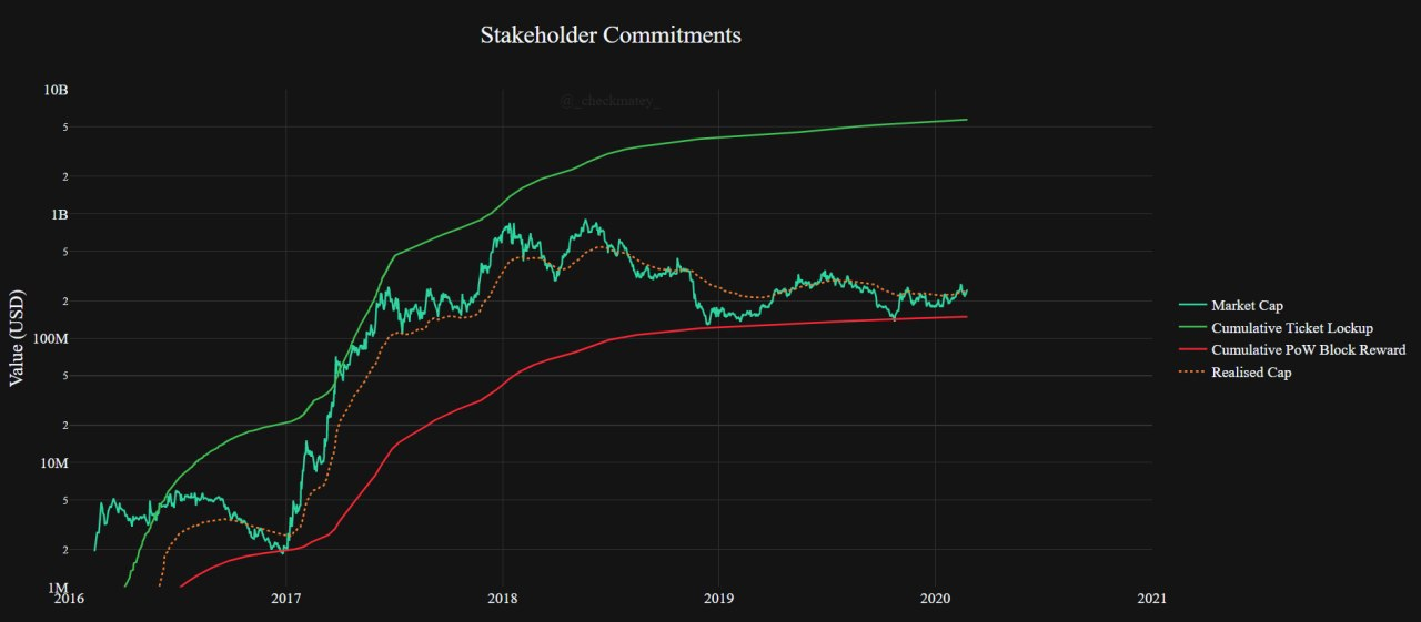
During bull markets the Realized Cap serves as support for the Decred Market Cap, and during bear markets it flips into resistance.
During bull markets the Cumulative Ticket Lockup serves as a magnet for market cap, and during bear markets the Cumulative PoW Block Reward has been a bottom magnet.
After multiple bounces off of the Cumulative PoW Block Reward line the USD Decred Market Cap is attempting to breach the Realized Cap. More on this from Checkmate near the end of this piece where he discusses the MVRV Ratio.

For the majority of Decred’s history, the 142-day sum of coins moved on-chain via standard transacting was ~10,000,000 DCR.
In Q4 2019 this high broke and this figure has climbed to 23,000,000 DCR today.
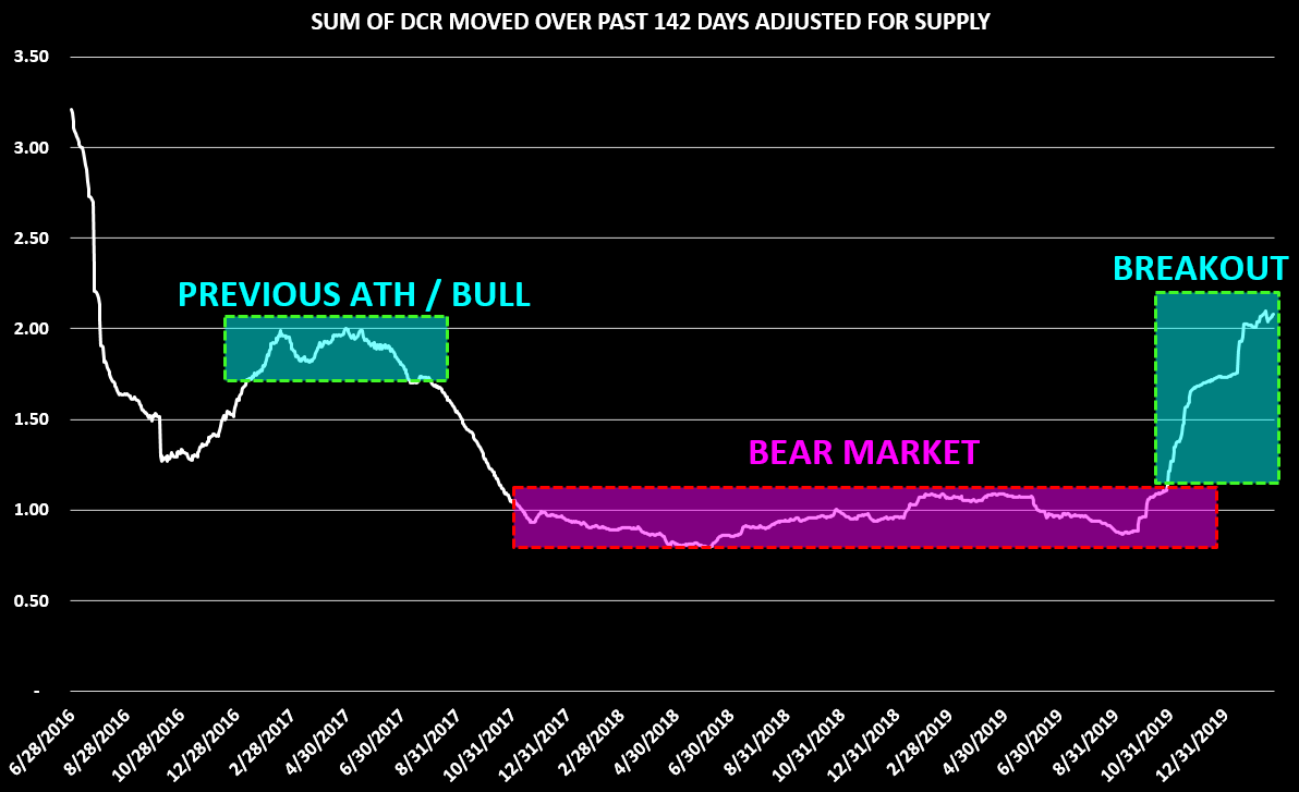
Take the previous chart and adjust for outstanding supply — and you still have a new all time high in DCR moved on-chain, with >2x the current outstanding supply moved over the past 142 days.

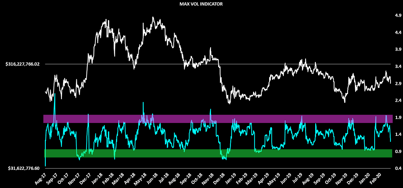
The Transactional Volatility Ratio aims to find periods when we can expect *relatively* many or very few coins to move.
As things currently stand — we’re overdue some coin movement, with the ratio sitting in the lower boundary.

The Throughput Thermometer compares on-chain throughput between two assets and adjusts for outstanding supply in order to ensure an apples-to-apples comparison is made.
This tool is best used to gauge macro bullishness or bearishness:
- When the thermometer is trending upwards, Decred on-chain flows are increasing versus Bitcoin on-chain flows pound-for-pound, which generally is paired with an uptrending DCRBTC price. Viceversa goes for a downward trending thermometer.
- The chart above shows us that over the past 142 days, Decred has settled 20% more native units on-chain than Bitcoin when adjusted for supply— an all time high for the Decred network.

By dividing the 28-day ticket volume sum by the 142-day ticket volume sum, we can identify periods where tickets are overbought or oversold.
The chart above marks multiple historical periods where overbought/oversold conditions emerged — which in multiple cases marked DCRBTC tops/bottoms.
By this measure, tickets are the most oversold they’ve been since the Proof of Stake Difficulty Algo change.
This is a tool that is yet to be published, and the description length will be limited as it requires a more detailed explanation. However, simply put — this takes ticket volume data and builds an Implied Market Cap for Decred.
The purple box shows where Decred is in overvalued territory, and the green box shows short term undervaluation based on ticket demand.
After spending substantial time clocking in at “overvalued”, the indicator has moved into a more neutral gear.

Decred On-Chain: Ticket Funding Rates explored the ROI of tickets and how they can gauge sentiment among DCR holders.
With this in mind — as of this week we had one of the lowest individual z-scores for ROI on tickets over a 28-day rolling period, as denoted by the purple arrow in the chart above.
This means that the ticket ROI currently is unusually far outside the 28-day mean, which has historically coincided with large price moves.
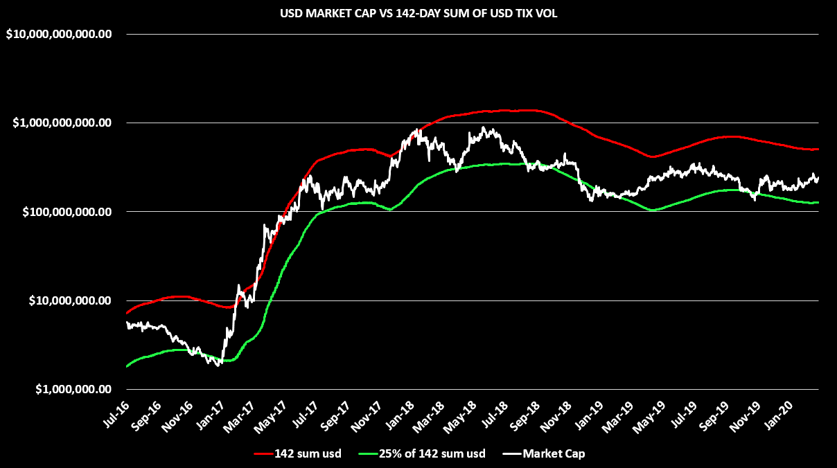
The 142-Day USD Sum of value that has gone into tickets has historically contained Decred’s USD Market Cap top, and conversely contained its bottoms at 25% of the 142-Day USD Sum into tickets.
Market Cap comfortably sits in this channel currently, leaving nothing too actionable for users of the tool.

The 142-Day HODLer Conversion Rate is currently bullish, paired with a bullish Realized Cap / 142-Cap cross.
Historically, when both of these conditions are present Decred price action has been up and to the right — all that we are waiting on now is for the Market Cap to breach the Realized Cap.
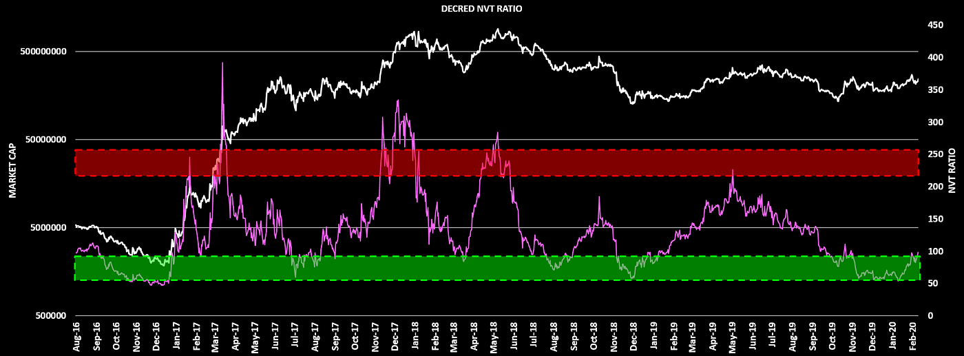
The NVT Ratio compares network value and on-chain flows to determine if the network itself is relatively overvalued or undervalued at any given time.
In the past this tool has helped identify DCRUSD market cap tops / bottoms— with NVT Ratios of >200 signalling overvaluation, and values <90 signalling undervaluation.
Decred’s NVT Ratio has a bottom-ish looking structure currently.

The chart above shows the 144 block rewards sum (excluding treasury rewards) versus the lifetime sum of these same block rewards paid to date.
In short, this aims to show immediate selling power versus the historical selling power sum.
This tool is similar to the Puell Multiple, but just zooms out even more.
The ratio seems to be testing / potentially exiting its almost three-year downward channel, which could be an early signal for a new uptrend.

As a useful follow up, this chart complements the previous one nicely, by providing a comparison of immediate selling power versus selling power sum over the past 365 days.
The relative immediate selling power is currently equal to conditions in late 2016 and the first quarter of 2018.
Lastly — the ratio is currently testing an 8 month trendline. *If* the line is broken, it would be safe to bet it would be done so in an explosive way.

The amount of activity DCR has seen on-chain since Q4 2019 has been interesting to watch — with lots of DCR changing hands, wide fluctuations in ticket buying, yet only modest movements in price following DCRUSD & DCRBTC price capitulation.
To quote my blockchain brother Checkmate:
“The Decred MVRV Ratio shows the relationship between the Market Cap and the Realised Cap. Since DCR is always moving on-chain in tickets, the Realised Cap tends to act as support in Bullish markets and resistance in Bear markets.
The DCR Market Cap has recently broken above the Realised Cap and the MVRV Ratio is retesting support on a trend-line which has contained it since mid 2017. The author expects the MVRV to act as an oscillator in response to Bull/Bear cycles.”

The above chart compares the market traded DCRBTC price versus the On-Chain DCRBTC price.
The On-Chain DCRBTC price is calculated by dividing the DCRUSD Realized Price by the BTCUSD Realized Price.
On-Chain DCRBTC price is particularly interesting because it has historically provided a reliable bounce zone for the market traded DCRBTC price, only to be pierced during Q4 2019 capitulation.
More on this indicator will come in a future write up as there is more to unpack here than meets the eye, but it is worth noting how the market traded DCRBTC price has consolidated around the On-Chain DCRBTC price…
Parting Thoughts
If we were to summarize the charts included within in a single sentence, it would be:
Signs of macro bullishness developing, but pending follow through.
Until then — we wait and see what happens next.
Signing out,
Thanks to Checkmate for his contributions in this piece.


Comments ()