

DCRDATA Making Markets
As we’ve seen throughout this DCRDATA series, there is a wealth of information on offer to help you better understand how the project is performing. DCRDATA is the place, if you need to validate information for Decred’s hybrid blockchain.
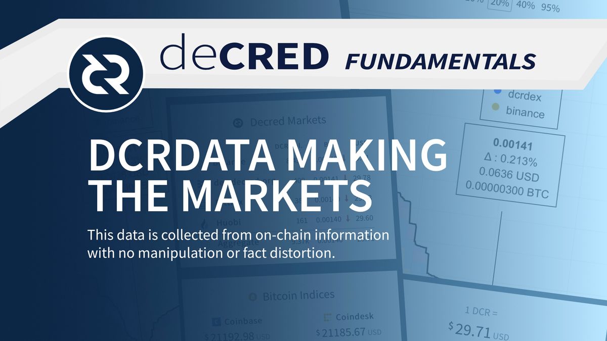
The data here is collected from on-chain information with no manipulation or fact distortion. The block explorer is just one of the reason’s blockchain is an improvement over traditional markets. Transparency, is the key to a better, fairer system. Don’t trust verify!
In this video, we’re going to look at DCRDATA’s market page as a staging point for our next series, using Decred’s decentralised exchange. In the distribution area, we get the current exchange rate in US dollars. If you click on the exchange rate link, it will take you to the market page. This is also available in the main menu, under the market link.
On this page, we also see the DCR value in US dollars, but we’re actually looking at the DCR/BTC markets across several exchange platforms. This can be confusing, but currently the best way to buy and sell DCR is through BTC. There are other trades, but they currently don’t have as much liquidity, or are secondary markets. In both cases, you will end up paying higher fees or have a higher margin for slippage, this is where the market moves away from the price you were expecting to pay.
On the left, we start with the price of DCR in US dollars, and then we have the main Decred Markets. All of which, as said before, are BTC/DCR pairs. The main markets for Decred are Binance and DEX.decred.org. Huobi and Bittrex have good levels of volume, but more often than not the main action is happening on Binance. DCRDEX is gradually built up momentum and will continue to do so, as it become easier to use, becomes more functional and gets more trading pairs. The Aggregate area might interest those who are looking to create profit from arbitrage in the discrepancies between the exchanges.
The final section on the left is the Bitcoin Indices, this section shows the current price of a Bitcoin using Coinbase’s current average price and Coindesk’s XBX price index that evaluates averages across several markets. And is touted, to be the most reliable index for Bitcoin price.
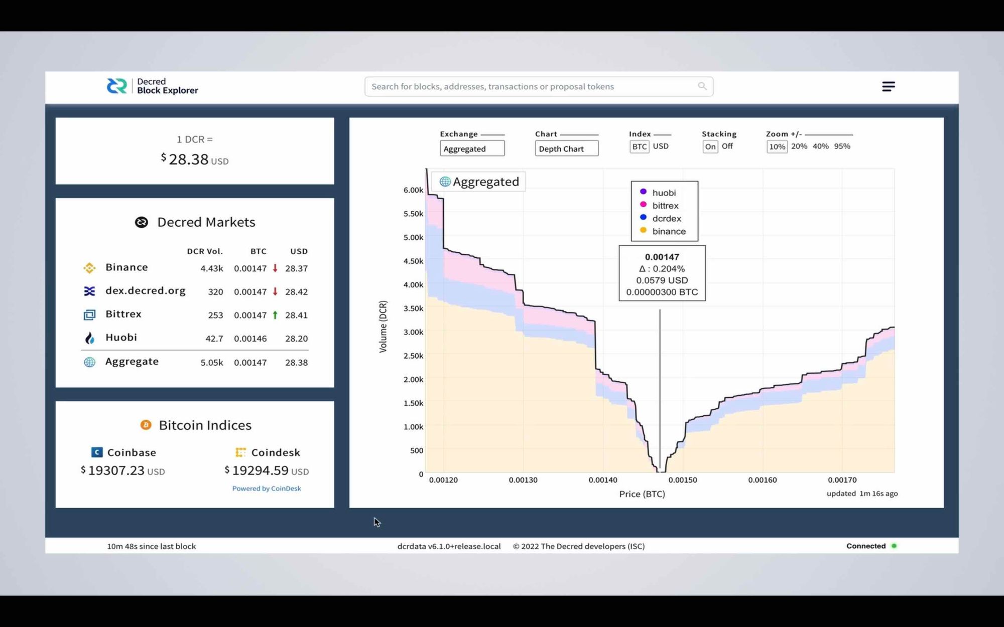
In the main area, of the market page you get the price chart, initially this is set to aggregate mode, in depth chart view, which stacks all exchanges and their market information. Each exchange is colour coded, Binance being yellow and DCRDEX being blue etc. In the middle, you have the market price, with buy and sell bids either side. Buy DCR on the left and Sell DCR on the right. There’s always a discrepancy between the market price and the closest buy and sell bids. This can be anything from a fraction of a percent upwards. This discrepancy is what makes the market. You can consider it to be a kind of tug of way, which, depending on sell or buy pressure, will move the price either up or down.
It’s important to note that the price is rarely the price. For instance, if you exchange at the market price, your order will actually get filled with the closest bid, which means you pay the slippage fee associated with where the close's bid was in the order book. This is the same whether you are buying or selling at market value, this is sometimes referred to as being a market taker. And anyone who places a bid is known as a market maker. There are benefits to both, if you want a quick purchase, being a taker is best. If you can wait and want to get a better price and make more profit, then being a maker is best. But be aware the waiting time can be considerable and can be quite disheartening if the market moves away from your position.
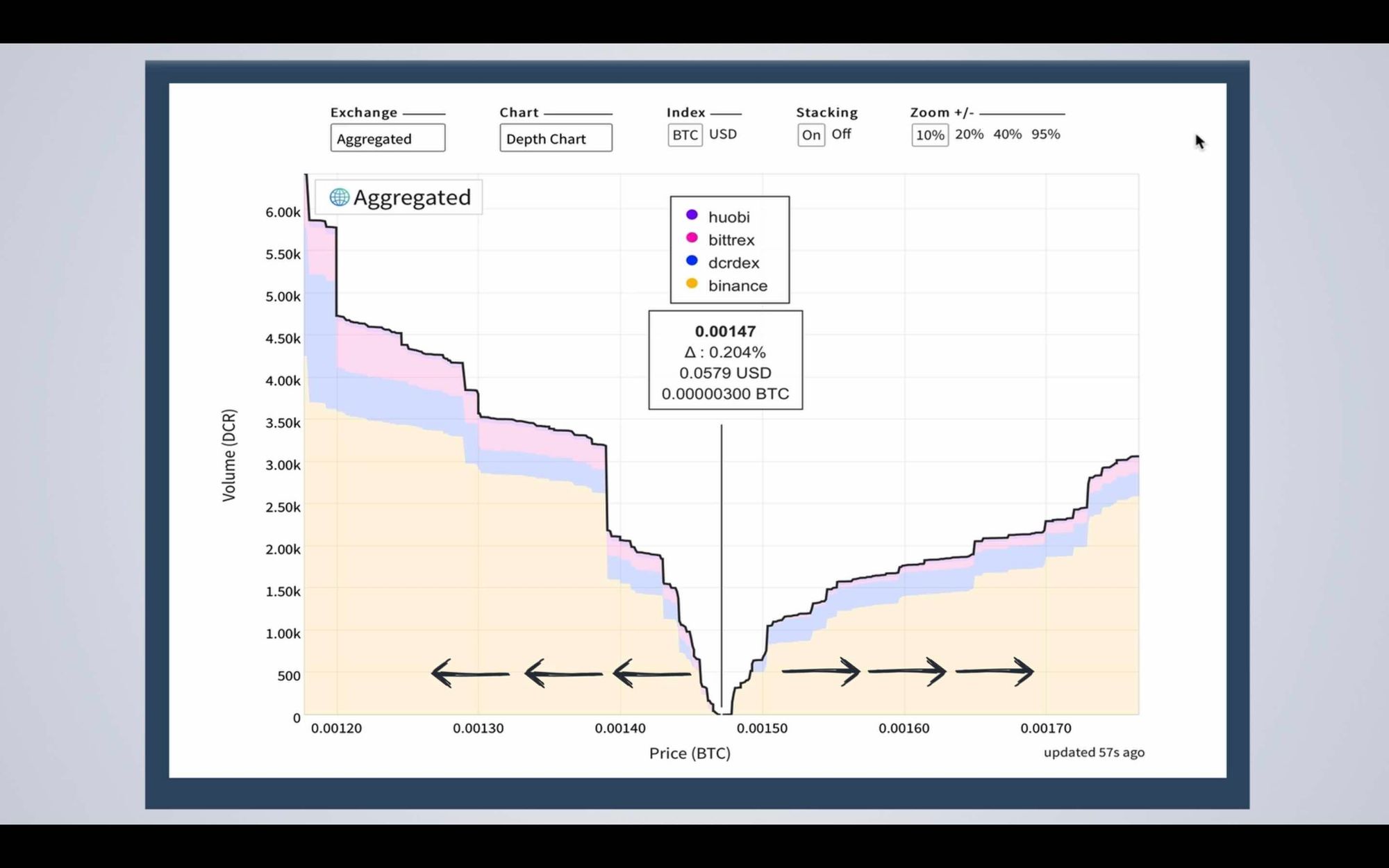
As a final note, buy and sell walls occur either side of the market price, these can be good indicators for the direction the market intends to move in. The walls can change direction quickly. For instance, if a wall appears on the left (people buying DCR) but there is no wall on the right (people selling DCR) the likelihood is the price will go up, as sell pressure is minimal. These walls can also indicate an acceptable price to both buyers and sellers when a wall accumulates around specific price points. For instance, in this chart (Sept 7th 9am – 9:30am) the buyers are forming a wall around 0.00140 BTC and the sellers are forming a wall around 0.00180 BTC. Depending on sentiment and sell or buy pressure, the price in this instance is likely to move down slightly. As the left-hand wall is establishing closer to market price, which acts as a kind of resistance that the market pulls toward. This could of course change if the wall on the sell side disappears and no one wants to sell at those prices. This is the beauty of an open market, where everyone gets to determine the price they want to buy and sell at.
Along the top, it’s possible to change some setting, like whether you are looking at the BTC price index or US dollar price index. Or whether you want the stacked view or a linear line indicator. You can choose to zoom in or out to see the whole market, or the market closest to the price. You can also decide whether you want to see all the markets or just one. Out of these options, I find the default settings the most useful.
Under the chart option, you have some interesting settings, some of which only work with individual markets. The first chart is the depth chart, which is the one we’ve been looking at.
The second is the order book chart, this allows you to see all the individual bids. In the current view, this is showing all the orders across all exchanges, but you can also change this to just show the orders from an individual exchange. For example, Binance or DCRDEX by clicking on the exchange drop down. One thing to watch out for in the aggregated view is green and red orders that crossover, this shows if there are any arbitrage opportunities available across exchanges and how big they might be.
The next chart is candle sticks, these only show up when viewing individual exchanges. Candlesticks are a discussion in themselves, but ultimately, they show the range of orders across a time-period. In the default view, each candle represents one hour, you can also change this to 5 minutes or 1 day.
The market history chart is probably the most familiar and shows the average price at a particular time, without all the range information.
The volume chart, shows how big the order books are at a given time, when overlaid with the price chart this can be a good indicator of the liquidity of the market. An important note about the volume chart is, these figures can be heavily manipulated to give the perception that a project is more liquid than it actually is. It’s probably best not to rely too heavily on this information, especially in the case of centralised exchanges where all trades happen off-chain.
Hopefully, that gave you some insight into how to read Decred’s exchange data. But as we move forward, we’ll re-visit this information to make our calculations for our trades. Thanks for watching and if you enjoyed this video and want to show your support, don’t forget to give it a like, comment and most importantly subscribe to the channel. And I’ll see you next time!

Comments ()